|
The restaurant name is going to be Masisuo. It will be located at Korea, Seoul. In the country the most popular food is BBQ stuff.I anticipate serving regular customers. Restaurant is going to be Dine-in and take out. I categorize my restaurant this way because I think this is the best way to serve all the customers and in Korea fast food are not popular in this country. I trying to server some korean short ribs, spicy rice cake and some kimchee pancake. I intend to put 6 different types of food. The food price range is going to be around $15 ~ $30. The layout of the menu is going to be the name of the restaurant on top with a image under it in the front cover and in each penal there is some picture that match with the menu. I want to use an image of some short ribs on a hot pot and with a bowl of soup next to it. I plan to go a Korean market then make some food and took some pictures. I believe when other people see this menu they will think this restaurant's food is delicious.
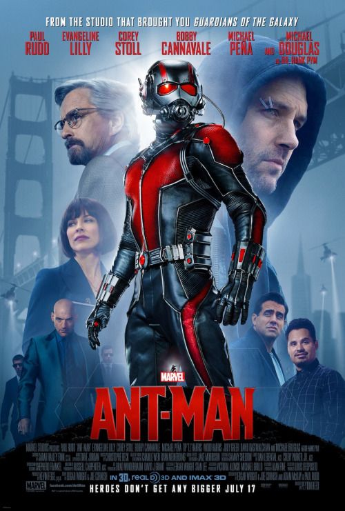 Based on the layout, visuals, and text on this poster. The movie poster's category I think is about Action movie. I think is this category because the main character on the porter is wearing a suit. The poster advertise the movie " Ant-Man". The movie genre is Action and Romance. The leading actor of the movie is Paul Rudd, Corey Stoll and Evangeline Lilly. The movie is released on July 17. The main figure on the poster is photographic. I think the designer chose this photo for the movie poster because I believe the movie is about this guy wearing his suit and fight foe peace. Based on the imagery and and text used in the poster I think the movie's audience will be teenagers and middle age. Because in the poster the leading actor is wearing a very interesting suit so it makes people wondering about it. And in this movie the tagline is "Heroes Don't Get Bigger" . This tagline help the make the movie more appealing to its audience by it make people thinking what kind hero he is.
The genre of the movie I will advertise with my poster is going to be about horror. I chosen this genre because I think horror movie is very interesting to watch and it is fun. My audience will be teens and adults. The intended plot of the movie I will advertise with my poster is going to be during a raining day night at school and 3 students was in their dorm room and something happen. The title is going to be "Night". The leading actor is going to be Yan Chen, Brittney Cartt and Alix. I will make the genre and plot to use to advertise the movie in my poster by the poster is going to take place in a raining day at dorm. The image I think to user is 3 girls setting each other and having a conversation. I intend to obtain these images by using my camera to take the picture. By editing my poster using some filters. I will use the blur filter and lighting effect to make the poster make more interesting. I want to make the movie posters title stand out the most because it will make the audience pay more attention to it. I like my future audience react like they want to know what’s the movie is about. Filter Challenge 1: I used the Oil Paint Filter to make the picture look like it is hand drawing and change the brush and lighting around. Last I used the the Brightness/Contrast to let the object stand out.
Filter Challenge 2: I used the Lighting Effect make the Eiffel Tower stand out from other I pick the color white make the intensity high and ambience high too. Last I used the Brightness/Contrast. Filter Challenge 3: I used the Liquify Filter use the brush to change to shape of the Eiffel Tower and other stuff. Last I used the Brightness/Contrast. Filter Challenge 4: I used the Pixelate Filter: Mosaic and Facet. Last I used the Brightness/Contrast. Filter Challenge 5: I used the Blur Filter to blur the background.  The theme of the magazine I choose is about fashion, the title is Charm. The theme of the magazine cover reflected the cover line by everything listed in the cover line is about fashion stuff that teach people what should they do to be more fashion.The cover image I used is my sister when she was 20 year old. For my magazine cover image I used 3 tools to edit the image make it better for a cover.I selected this image because I think what my sister ware is pretty and I feel it is about fashion.My magazine's target audience is teenagers. The cover image and cover line appeal to my target audience because I think most teenagers I stuff that is about fashion and pretty stuff and they want to make themselves more charm using some tips.
For this cover image I used the Blur tool, Auto Contrast and Free Transform to edit my image. And I also used 4 different fronts ,5 different sizes of types, for caption I used leading and tracking, for my cover line I try to made it alignment to each other and last I used layer style to all the types. By using the visual hierarchy for my types for the important thing like the title I used all capital letter to show it is important and it is the biggest size front in the magazine cover, next for the cover line I made the front size bigger than the caption so it will stand out. Overall, I think my magazine cover wasn’t what I expect to have. If I were to being my magazine over again I want to make the types and image more interesting. According to the article it is important for magazine to be consistent with design because it will build a strong visual identity. But we can’t change it too often. The basic of typography hierarchy are making sure the the magazine is readable and choosing the right color. A designer might sketch the cover layout on paper first so that way they won’t keep changing their ideas. The magazine layout must be consistent from one issue to another. The layout must remain the same so the reader can easily recognize it. One helpful piece of advice is to use grid. It is helpful because by choose the right grid the magazine might become popular. The theme of my magazine probably going to be about fashion/beauty or music. The title of my magazine probably is going to be Charm. Articles will be about what to wear during a special date, best selling beauty item, etcThe cover page I want to be a person that wearing a beautiful dress. I plan to take this picture myself.
 Positive space means the shapes of an objects in an image. Negative space means the area surrounding an object in an image. In the first edited image the positive space is the person shade in blue and negative space is the black background. In the second edited image the positive space is the person shade in black an white, the negative space is the blue background. Two techniques I used in the challenge is to change the picture to black and white and use the quick selection tool.
 I choose the KFC logo, because KFC is a well know company and it has been around us for so long we almost see it everyday in our life. Three most visual qualities this logo appeal is the the type front how it change from a simple deign to a interesting words. And the symbol of the guy that represent the company. Last the color of this KFC logo red, and it is a very bright color we can even see it far away. Those three qualities appeal to me is that combine all those qualities together make up this logo was a very good idea. The brand name “Kentucky Fried Chicken” was reduced to its abbreviation, “KFC”, from the early 1990s. The company wanted to fend off the fatty connotation of the word “fried”. It change from how it from the first logo it was black and white, also they only write first initial of each words so now it became KFC and word is the type differently. If I were to redesign this logo, I will make the "KFC" size front bigger.
The Photoshop tool my team was assigned tool was the Blur Tool. The function of the Blur Tool is used to soften or harden the uneven portions of an image. First you get any image. Second, open it in photoshop. Next, on top of menu bar, click Filter > Blur and start blurring the image. I might use this tool in a future project by highlighting an object in a photo by blurring the other objects. Some advice I would give to my peers when using the Blur Tool is make sure you DO NOT blur out the whole image but certain areas of the image.
 In this self-portrait the tools and techniques I used in Photoshop is Magic Wand Tool Gradient Tool and Brightness and Contract Tool. I find out that the most interesting tool to use is the Gradient Tool, because I can change my portrait to many different color as I want to. If I were given the opportunity to start over again I will pick another image because in this image I wear a white swather and the background is also white too so when I use the Gradient Tool the background and my body combined together. It looks like my body is disappear.
 In this digital collage I used all image that remain me of home. The image of the Chinese New Year background I appropriate from "Google" and also the Chinese butterfly flag I appropriate from "Google" too. The image of my sister and me sat on a chair, the Chinese money and Chinese snake are all my personal images. The tool I used to combine the appropriated and personal image is the Layer Mask tool, Quick Selection tool, Lasso tool and Move tool. I depict the theme of home by use my favorite snake from my childhood and the traditional Chinese New Year background. Viewer might perceive the theme of home by saw a picture me with my family member. If I were given the opportunity to start my collage over again will I add more of my personal image and add more family member image.
 This image is a build of an image of my niece, first I create 16”x 12” (in) background than I put all 12 variation all in one, and the each of the variation I used hue/saturation adjustment. And in this image I used many tools but the most important were move, crop, adjustment, and transform and other is the hue/saturation adjustment and the contrasts. They are similar because all of them are taken from one simple image. But the difference is that they are variations of different parts of a selected or specific place inside it. I try to separated similar colors to make it see more variated or extravagant by having bright and dark color in one image at the same time. Probably next time I will try to get a bigger image so I will be able to expanded even more and change the colors between them.
My name is Yan Chen, I'm 17 years old. During my spare time I enjoy to watching movies and listening to K-pop musics. I'm admire Keith Haring''s artwork and his style, because in his work it shows all street style and his is famous as New York Street artist . I select digital art because I like to learn about how to do photo editing.I had experience drawing and painting I use a canvas to draw and pain with painting color. My learning gold for this year is that to create a 3D photos. I'm intend to fulfill these learning goals by trying my best in this class.  |

AuthorYan Chen 18 Years Old Archives
May 2016
Categories |


 RSS Feed
